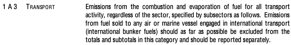
Today’s piece centers the fourth largest contributor, transport, which contributed 14% of all anthropogenic GHG emissions in 2010. I think transport more or less speaks for itself. The only caveat is that, in some instances international bunkers (that is, the energy “consumption of ships and aircraft on international routes”) are carved out as their own category (and strangely, in the process, also not attributed to any country). As best I can tell, AR5 rolls emissions owing to international bunkers into the 14% for transport. As with all of the other high-level categories, transport is so broad as to be extremely hard to think about in a meaningful way, but at least breaking down the sources of GHG emissions into these five large buckets creates a slightly clearer framework for beginning to consider the character of the challenge of transitioning away from dependence on fossil fuels.
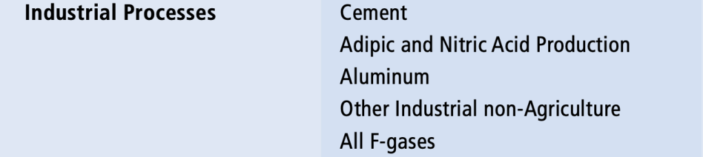
Today’s piece will be short and sweet: The third largest contributor to anthropogenic GHG emissions in 2010 was industry which contributed (a word that sounds so positive!) 21% of all such emissions. The somewhat-dated WRI chart to which I’ve referred before includes the following chart:
More accessibly, William T. Vollmann, in his sweeping two-part Carbon Ideologies books, references “the “Big Five” materials, namely: Cement, Paper, Steel, Plastics, and Aluminum, in descending order of their emissions footprint, though of course industry encompasses a variety of activities varied almost beyond imagination. I highly recommend these long, dark, funny, humane books, and hope you’ll consider them today’s bonus material.
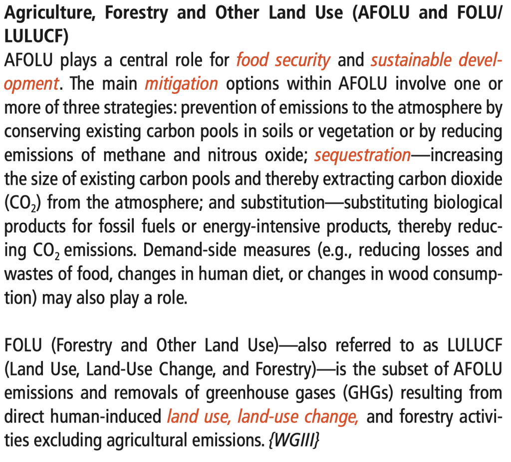
To summarize, climate crisis is the defining issue of the century. Buildup of anthropogenic greenhouse gases (GHGs) in Earth’s atmosphere is driving global heating, while a convergence of global crises threatens to rupture key planetary boundaries beyond which organized human life on Earth would be threatened. Although the human activities which drive these converging crises (for simplicity: the climate crisis) are diverse and complex, the Fifth Assessment Report (AR5) of the Intergovernmental Panel on Climate Change (IPCC) offers a high level categorization of the sources of anthropogenic emissions. Yesterday’s piece focused on the energy sector, the largest single contributor to anthropogenic GHG emissions (at 35% in 2010) according to the IPCC. Today’s piece centers the second largest contributor (at 24% in 2010), namely: agriculture, forestry, and other land use (or AFOLU).
The name of this sector (if something so broad can even be called such) more or less speaks for itself, but here’s some text (from page 118 of the AR5 Annexes) describing AFOLU mitigation opportunities that offers further texture regarding the complexity and character of the AFOLU challenges:
Without attempting to get into any details, I’ll just note that the concept of “net emissions” is especially important in attempts to quantify AFOLU contributions to total GHG emissions given that – unlike say the energy sector, which basically only emits GHGs into Earth’s atmosphere – the interplay between land, atmosphere, and human activity is such that AFOLU as constituted can be seen as both emitting and drawing down GHGs to/from Earth’s atmosphere. This sector is of particular interest to me personally (owing in no small part to my love of plants), and I continue to follow with interest and balanced enthusiasm and skepticism efforts to “green” cities, grow more food in urban areas, install green roofs, etc., etc. The rhetoric is often bombastic, and the motivations are sometimes suspect, but as with simple energy efficiency measures – if instituted at scale (see Japan’s Cool Biz initiative) – urban AFOLU offers modest but real emissions-reduction low-hanging fruit.
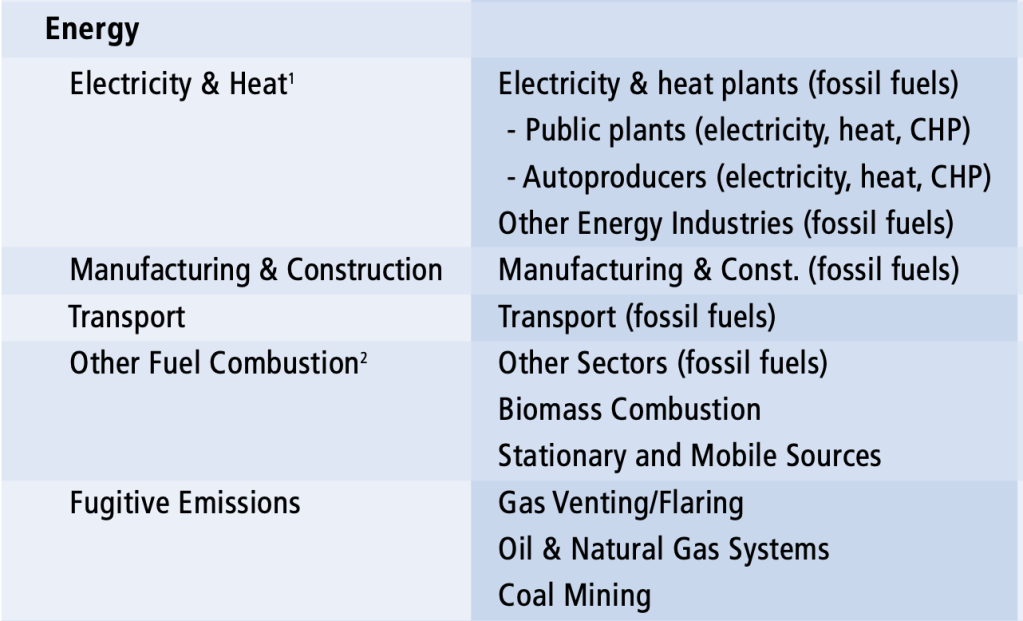
Following AR5’s schema, today’s post focuses on the largest source of anthropogenic GHG emissions, the energy sector, which, according to the IPCC, contributed 35% of anthropogenic GHG emissions in 2010. In the spirit of continuing to try to keep these primers as simple as possible, I offer here the following helpful chart from the World Resources Institute that breaks down the component emissions sources which constitute the energy sector as defined by the IPCC:
As you can see, not only does the energy sector include the production of electricity and heat through the combustion of fossil fuels (note: “Autoproducers” are plants that produce electricity or heat for private consumption, as in the case of a university or a factory running its own power plant), but also the manufacturing and production of fossil fuels; the transportation (think pipelines, trains, tanker trucks, the mid-size tanker ships that ply constantly the waters around New York City, or the larger tanker ships that occasionally spill, catastrophically, for example off the coast of Alaska in 1989 or, without preventive action, off the coast of Yemen in the coming months) of fossil fuels [The WRI document on which I relied seems actually to be in reference to a dated IPCC “Common Reporting Framework”; see below for details]; other instances of fuel combustion, both of fossil fuels and of biomass; and the “Fugitive Emissions” that occur in the extraction, refinement, and transportation of fossil fuels. Interestingly, on this last front, during the decade or more when the popular lie was current that natural gas was a “sustainable” “bridge fuel” the use of which could allow for an accelerated transition away from reliance on coal (a lie that was peddled by a number of the “Big Green” orgs, like the Sierra Club), the failure to account for the massive fugitive emissions of methane that have accompanied the shift, in the US, from coal to natural gas combustion in electricity generation led to very optimistic accounting of comparative GHG emissions. Data now suggest that the net benefit from shifting coal to natural gas was relatively limited, at best, because the fugitive emissions from fracking, refining, piping, etc. natural gas are so substantial, but in the meantime, a decade was wasted, a lot of expensive soon-to-be-stranded assets were constructed, and a lot of money was made.
Today’s bonus content is sad but, to those who are interested, I hope will prove helpful: The tanker currently stranded off Yemen’s coast apparently contains roughly 1.1 million barrels of oil, while the Exxon Valdez spilled roughly one quarter of a million barrels of oil off (and onto) the Alaskan coast in 1989. Meanwhile, in what Wikipedia suggests “was called by some scientists the worst environmental disaster ever in Mauritius,” in recent weeks a Japanese bulk carrier has dumped some 10,000 barrels of oil into the waters surrounding that island nation. Closer to home (for me), every day, dozens of similar vessels, belonging to companies like Reinauer, can be spotted in the waters of the Hudson, the East River, and New York Harbor.
Correction: The dated IPCC Common Reporting Framework to which the WRI (and thus I) referred in fact includes the entire (fossil-fuel dependent) transport sector as a subset of the energy sector, so my characterization above is in error. Here are further details from the IPCC’s Revised 1996 Guidelines for National Greenhouse Gas Inventories:
As previous posts on planetary boundaries made clear, any schema of categorization is bound to have flaws and limitations. As those posts also made clear, identifying sources of GHG emissions or causes of climate change is not sufficient in seeking to understand the forces driving the intersecting climate and ecological crises (for simplicity: the climate crisis) now unfolding on Earth. That being said, it’s not my intention to attempt to rewrite the Fifth Report (AR5) of the Intergovernmental Panel on Climate Change (IPCC), and so I will simply rely on the schema of the same in briefly pointing to the economic sectors responsible for the lion’s share of global anthropogenic GHG emissions (though please bear in mind that AR5 was published in 2014 and was backward looking so is already nearly a decade out of date as reflected by the 2010 date in the graphic below).
To that end, next week, in following the IPCC’s framework, I plan to briefly discuss, in descending order of contributions to global GHG emissions: 1) the energy sector; 2) agriculture, forestry, and other land use (referred to, in AR5, and elsewhere, as AFOLU); 3) industry; 4) transport; and 5) the building sector. Such a ranking of contribution to GHG emissions does not take into account “indirect emissions” (that is, “emissions from electricity and heat production [that can be] attributed to the sectors that use the final energy”) and considering indirect emissions changes the ranking significantly.
Posts next week will get into some of these issues, but for now, I give you as both conclusion and bonus material, the following pie chart (with its original caption) from AR5 of the IPCC, depicting both the GHG emissions by sector, and – in the expanded “Electricity and heat production” section – the breakdown of sector-wise indirect emissions: