If that title seemed half funny, this post, unfortunately, will not. Panicking never helps, so please don’t panic, but by the end of next week, if not well before, New York City will likely be largely shut down. Here’s why, in five graphs. If you don’t care about the math, please skip the captions.
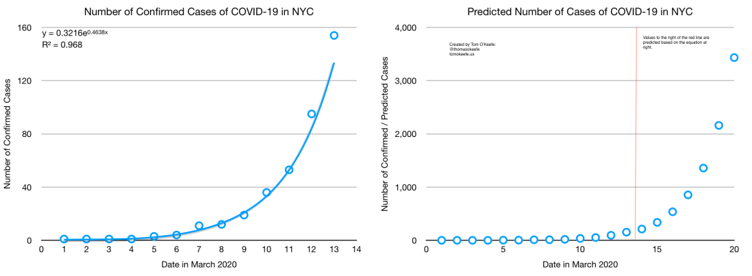
Confirmed Cases
The first two graphs show the number of confirmed cases in NYC according to the official figures released by the City and State, and the predicted number of cases going forward based on an exponential regression. Friday’s data was the last to be incorporated into these. I would’ve updated them with Saturday’s data, but the predicted value according to this model for Saturday was 212.45 and the official figure released was 213, so I’m leaving everything as is.
The Wuhan Data
Sadly, it gets worse. Accordingly to the following graph from a study by the Journal of the American Medical Association (JAMA) of ~45,000 cases of COVID-19 in Wuhan, the number of confirmed cases (here: “By date of diagnosis”) lags but roughly mirrors the number of total cases (here: “By date of onset”) by roughly a week.

Using the pattern from the Wuhan data, I extrapolate predicted NYC values. There’s no saying that the pattern in New York has been exactly the same as that in Wuhan, but, in both cases, municipal, provincial/state, and national governments were caught totally unprepared by a novel pathogen, and – in spite of having had two-plus months lead time and the advantage of their example – I wouldn’t say we’ve done any better in handling this here than our peers in Wuhan did there.
That said, let’s apply this same approach to the New York numbers. This gets very ugly.
The Business-as-Usual / Worst-Case Scenario
This graph is based on the assumption that we have done and will do nothing significant to limit the spread of the virus before March 20th. Obviously, that is not true, and so this graph should be treated as an upper-bound showing just how bad things could have become. Sadly, while we have taken a number of measures, based on the scene I saw (on my walk to the water yesterday evening) at bars and restaurants, a great many people are continuing to treat this as usual business.
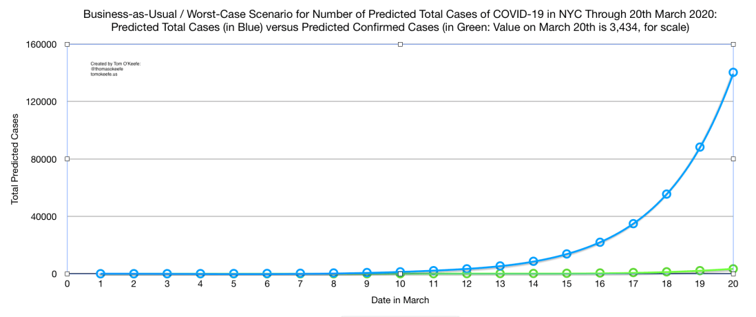
If these numbers are anywhere near correct, then we could be looking at ~100,000 total cases of COVID-19 in New York City by next weekend. New York City has ~20,000 total hospital beds and 5,000 ventilators. Given that ~20% of COVID-19 patients require hospitalization, and approximate 5% of patients require intensive care, we could be at or beyond the capacity of the City’s medical system by this time next week. This is why the idea of flattening the curve has become ubiquitous in recent days; unfortunately, we’ve likely missed the opportunity to flatten it enough to avoid a real crisis, but what we do in the coming days will determine how bad that crisis gets. Every day we delay, this gets worse.
The Less Bad News
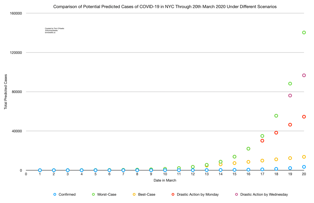
It hardly feels like good news to say that we could only have tens of thousands of cases of COVID-19 in New York City by the end of next week, but, for sake of comparison, this final graph shows four different scenarios, plus the predicted number of confirmed cases (here in blue) from our second graph which, as in the fourth graph, now looks very small.
Briefly, below:
- Green plot points show the worst-case scenario from above (~140,000 cases by Friday, March 20th);
- Purple plot points show a scenario under which drastic measures are taken starting on Wednesday, the 18th (~97,000 cases by the 20th);
- Red plot points show a scenario under which drastic measures are taken starting on Wednesday, the 16th (~54,000 cases by the 20th);
- While the yellow show what could have happened had we taken drastic measures (as opposed to half measures) starting on Friday, March 13th (leading to only ~14,000 cases by the 20th).
Note that the red plot points are identical to the green through the 16th, and purple plot points are identical to the green through the 18th, while yellow points diverge from green after the 12th.
Obviously, whereas in Wuhan, an authoritarian government moved to almost totally lock down an entire megacity, here many people and institutions have taken significant actions, which will no doubt steer us away from an absolute worst-case outcome, but as of this writing, public schools, mass transit, bars, restaurants, gyms, daycares, etc., etc., etc. remain very much open in New York and much of the population is demonstrably not taking recommended hygiene and social distancing measures. Where, exactly, the curve will fall for our particular circumstances is well beyond my ability to predict, especially given the shocking paucity of publicly-available data and the overwhelming number of unknowns (not least among them: Will the testing capacity actually be ramped up significantly, and would that bear on any of my assumptions above?), but what is beyond doubt is that we are in for some very hard weeks ahead, and that without bolder action by the City government, and more universal commitment to confronting this crisis from the City’s population, this situation will get much much worse before it starts to get better.
If ~140K is the upper-bound, and ~15K would have been the lower had we taken commensurate action starting on the 13th, that leaves a wide range of potential outcomes. Much power to shape what happens remains in our hands, but we’ve now forfeited the opportunity to avoid a deep crisis.
Postscript: To see a (more) flawed previous version of this post, click here.
And a note on usage: “confirmed cases” refers to those cases that have been confirmed by a positive test for the disease, whereas “total cases” refers to all cases (confirmed and unconfirmed) extant in the population. Obviously, it is much harder to know the latter than the former. Above, we first predict the number of confirmed cases until the 20th. We then extrapolate further from the predicted number of confirmed cases (in case “Predicted Confirmed Cases” was confusing) to make an estimate of what the number of total cases will be.

11 thoughts on “Going Viral: Why New York City Will Soon Be Shut Down in Five Graphs”