As the President fires “one of the nation’s leading vaccine development experts” for refusing “to approve the widespread use of the drug hydroxychloroquine,” wonders aloud if people should be injecting bleach to combat COVID-19 (leading “the maker of Lysol” to issue “a stern warning that “under no circumstance should our disinfectant products be administered into the human body”” and Dr. Craig Spencer to respond on Twitter, “Instead of being asked about how we improve our #COVID19 response in the coming months, doctors are being asked to comment on why people shouldn’t drink things like bleach or isopropyl alcohol. This has to stop.”), and retweets a fictional supporter of a very real terrorist group; China struggles to contain a new (imported) outbreak of COVID-19 in another city of 10+ million that almost no one in the United States has ever heard of; evidence from India hints at spread of the disease far exceeding that indicated by the official numbers; and “Morgue Workers” in New York City “Struggle to Give Coronavirus Victims Death with Dignity” while new work out of Northeastern University suggest that “Hidden Outbreaks Spread Through U.S. Cities Far Earlier Than Americans Knew” (and that there were already ~10,000 people infected with SARS-CoV-2 in NYC at the time that the first official case was recorded) and the most-widely-cited model suggests that, under a best-case scenario with thorough, as-yet-non-existent measures in place, “relaxing social distancing” may be possible in NYC by the end of May, I’d like to turn today, as briefly as proves possible, to the numbers.
There are a lot of them. And people are confused.
In fact, the confusion is so deep and so fundamental that academic researchers are now studying the differential impact on COVID-19 mortality attributable to watching Sean Hannity versus Tucker Carlson and questioning grimly in their titles: “Coronavirus Disease 2019 […] and Firearms in the United States: Will an Epidemic of Suicide Follow?”
Coming to the point, though, sadly, we continue to operate in a haze of uncertainty about even the most basic features of this disease. A few cases in point: Recent surveys using serological/antibody tests in Germany and California (in Santa Clara and LA Counties) suggest, unsurprisingly, that much higher percentages of the various populations have been infected with SARS-CoV-2 than official case counts indicate. In the German town in question, nearly 15% of those tested came up positive for antibodies against the disease, while in Santa Clara and LA Counties, researchers estimated – based on test results – that 3-4% of people had been infected. Almost immediately though, these claims were subject to numerous criticisms, chief among them that: 1) The samples were not random (in the case of Santa Clara County, for example, people were recruited via Facebook ads), and 2) that the tests themselves were not terribly reliable.
Additionally, in the case of the German study, the lead researcher “had argued even before the study that the virus is less serious than feared and that the effects of long shutdowns may be just as bad” as those caused by the virus – a position similar to that of John Ioannidis of Stanford, who attracted a lot of attention in mid-March with this article that, in my view, has already aged very badly (although I will agree with Ioannidis’ assertion from a subsequent paper that “Strategies focusing specifically on protecting high-risk elderly individuals should be considered in managing the pandemic” while also reasserting my own steady refrain: This whole situation was avoidable, and we should never have been in the position where a shutdown became necessary in the first place.)
The German study yields an infection fatality rate (IFR) of 0.37%, while Ioannidis March paper posits an IFR of 0.125% (with a possible range of 0.025 to 0.625%), and yet by simply looking at the New York City data to date, we can see that – either New Yorkers are especially unhealthy and susceptible to die from this disease – or these figures (barring the very highest end of Ioannidis’ range) are not particularly plausible. I’ve written this up elsewhere in detail, so suffice it to say here that because a great many rich people, and plenty of not-even-rich-but-comfortable people have left New York City indefinitely at the moment, I feel comfortable using 8 million as the City’s current actual population, while because the City, State, and Federal Governments have done such a dismal job of data collection and reporting, I feel comfortable estimating that 20,000 people have already died in NYC of COVID-19 (though I’ll come back to this figure in a moment, and the true count is likely higher by now).
Simple math then yields the following for the crude mortality rate in NYC thus far from COVID-19:
(20,000 / 8,000,000) * 100 = 0.25%
That’s the percentage of the entire population of NYC that has already died from this disease. Okay, but based on the results released yesterday of the first large-scale serological testing in New York, ~20% (21% according to the survey results) of people in NYC tested positive for antibodies against SARS-CoV-2. These results are subject to most of the same criticisms already addressed above, so should be taken with a grain of salt; however, I’m at least gratified that my previous estimates (based on data on the number of birthing people at two NYC hospitals who had tested positive for the virus in recent weeks) seem to have been reasonably accurate (here’s what I wrote on April 14th: “I’ve been guessing that somewhere from 10-50% of New Yorkers have already, at some point, been infected, with a best guess putting the number at ~20%, and these ~15% figures [of birthing people testing positive] seem to validate that guess to some extent.”).
Using the 20% figure, we then get the following for an ~IFR for NYC:
[20,000 / (8,000,000 * 0.2)] * 100 = 1.25%
That actually seems a little high to me (my best guess would put the IFR somewhere between 0.6% and 1%) but one also imagines that not a lot of essential workers (and especially not a lot of undocumented people) ended up being sampled here. In fact, according to Reuters: “The survey targeted people who were out shopping, but not working, meaning they were probably not essential workers like grocery clerks or bus drivers. Those surveyed were more likely to test positive for antibodies than someone isolated at home, Cuomo said.” Those caveats work in opposite directions – excluding high-risk essential workers, but perhaps including people more likely to put themselves at risk regardless of the nature of their work – as do the facts that the death count and the infection rate are likely both higher by now than the figures above suggest.
So then, finally, why can’t we at least agree on some basic facts? Because we were so woefully underprepared for a public health crisis like this one. As I’ve written about extensively elsewhere, the City and the State can’t even get their numbers square in New York, and that has been leading to confusion since day one. In fact, it took both the City and the State weeks to get public-facing data portals launched online, and they continue, to this day, to share confusing/misleading data. A quick example: I get newsletters from Manhattan Borough President Gale Brewer (which are chock-full of helpful announcements), and these newsletters always start with the latest figures for NYC. Her office had been relying on the widely-used Hopkins tracker, but yesterday, they wrote:
But Johns Hopkins has a lag, so going forward we’ll now relay the count prepared by nonprofit news site The City, which consolidates and cross-references data from the NYC Department of Health and Mental Hygiene, the Governor’s office, and several private sources, including the Johns Hopkins tracker. Visit their page here and see how robust their data are.
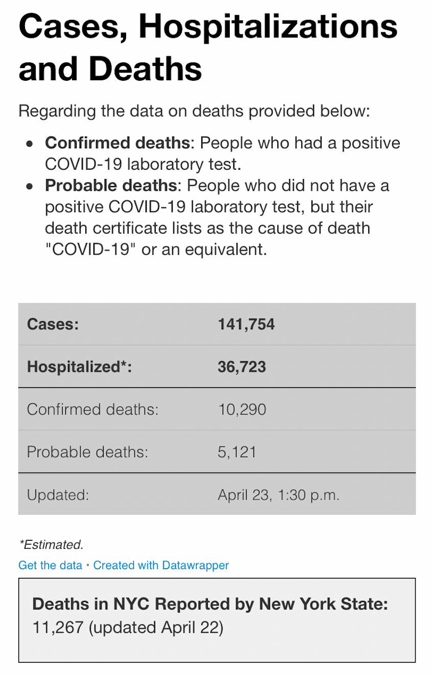
I’ve linked to The City before, and I find their data page helpful; however, so far as the top-line numbers are concerned, The City (the news outlet) is simply copying directly from the City (of New York)’s official data portal, but taking the one additional step of actually adding together what the City presents separately as “Confirmed” and “Probable” deaths. For some time, and still, the City’s portal trailed the State’s in reporting the latest fatality figures (for reasons I’ve explored previously), but since the City started counting “Probable” fatalities, a new problem has arisen, as the State – although it pledged to – does not yet seem to be counting those deaths. In fact, as I’m writing this (around 1 PM on Friday, April 24th), The City – simply aggregating figures from the City – shows 15,411 total deaths for NYC, while the State shows 16,162 deaths total state-wide, but with nearly 5,000 of those outside NYC.
To complicate matters further, the Hopkins portal – on which Brewer’s office has stopped relying – currently shows a mortality figure for NYC alone of 16,388. How did they get that figure? By adding up the total deaths in each of NYC’s five counties as shown on the State’s portal, not as they currently stand (which, at the moment, yields, 11,544), but as of yesterday’s update (11,267), then adding the the number of “Probable deaths” from the City’s portal (5,121) – simple:
11,267 (State’s figure from yesterday for the City)
+ 5,121 (City’s current “Probable” figure for itself)
= 16,388 (Hopkins tracker’s current figure for the City, which exceeds the State’s entire figure for itself as of today)
and it is by taking this figure, and then adding the 3,000+ additional deaths above baseline since the onset of COVID-19 in NYC (the deaths that are, according to the City, neither “Confirmed,” nor “Probable,” and yet which, even the Mayor admits, must be COVID-19-related, and to which I’ve been referring as “Still-ignored”) that I arrived at the above figure of ~20,000 COVID-19 deaths in NYC to date.
You can see why it’s next to impossible to have any confidence in data around our current global predicament. Yet, we’re doing a much better job here in New York than are many governments around the world (eg, New York State has tested significantly more people than have been tested in all of India), and everywhere one looks, one finds evidence of data failures; for example, a study in The Lancet argues that “China may have had four times as many cases as [indicated by the] official figure” (additionally, the Chinese Government recently adjusted up the fatality figure for Wuhan by 50%), and a Financial Times analysis suggests that COVID-19 deaths in the UK are double the official count.
What do we do?
First, we should never lose sight of the fact that these confusing and ill-maintained figures represent people. We’re suffering through a time of heartbreaking loss, and we can only hope that the trauma will strengthen our resolve to shape a better future, while also shedding light on the breathtaking misery that has persisted in our midst (in the form, for example, of poverty, inequality, and endemic infectious diseases) largely unheeded.
Second, we can look for voices that offer some clarity in the midst of all this muddle. To that end, I’ll close by pointing to the work of a whole raft of visionary women of color: Our friend Lalita has this thoughtful piece out on the “The Immeasurable, Cascading Effects of Primary Care” against the backdrop of the pandemic; there are more great insights from Sonia Shah (primarily on the paradoxical connections between migration and disease) in this webinar; this interview on Democracy Now! with Dr. Syra Madad, the Senior Director of the System-wide Special Pathogens Program at NYC Health + Hospitals, is especially illuminating; I really enjoyed Jeremy Scahill’s interview with Dr. Seema Yasmin “a former officer in the Epidemic Intelligence Service at the U.S. Centers for Disease Control and Prevention”, and this conversation between Mehdi Hasan and Arundhati Roy – and a quote from Roy, in particular, on the present unreliability of numbers regarding COVID-19 – gives this piece its title.
Read, listen, watch, think, and be well. There’s an alternative to fascist dystopia and it comes from all of us.
——
Note: I’m including below screenshots of the various portals and trackers as mentioned above.


5 thoughts on “A Mattress at Sea”